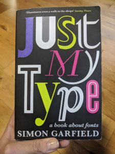
Just My Type by Simon Garfield
Written by Ashley Kelmore, Posted in Reviews
Best for:
Those who enjoy a bit of trivia about common things; those interested in graphic design.
In a nutshell:
A history of fonts, with a focus on some of the better-known ones.
Worth quoting:
“If all letters were exactly the same height they wouldn’t appear so: round and pointed letters would appear shorter.”
“They established that it is a lot easier to read lower-case letters than capitals when travelling at speed.”
Why I chose it:
I love this kind of shit.
Review:
There’s not a ton I can say about this book that isn’t just be sharing interesting trivia I learned. Like, as referenced above, researchers have determined that it’s better to put location names on road signs with upper case starts followed by lower case letters. It’s because one looks for the shape of the word, not the individual letters. And so can spot the shape they’re looking for before they can read the word.
Do you find that nugget of information interesting? Then this book is for you.
Author Garfield takes us on a trip that isn’t so much chronological as focused on subject areas. He shares the history of some well-known fonts (starting with Comic Sans!) and why they come to be. He also looks at issues like: do fonts have a gender? A nationality? Do they evoke a time period to you?
He also shares some of the more technical things about fonts. For example, what makes a font easier to read online makes it more difficult to read on paper and vice versa. Which is super annoying for me in my work, as I produce many documents that need to be readable in both formats.
This is a fairly niche book but it’s also accessible. If you’re looking for a gift for someone who you think might enjoy this type of thing, they probably will like this one.
Keep it / Pass to a Friend / Donate it / Toss it:
Donate it.

